Showing posts with label percent return. Show all posts

Saturday, March 28, 2009

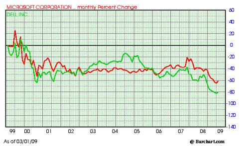
Microsoft and Dell, Dead Money, Chart and Comparison


Microsoft (MSFT) and Dell (Dell) , Ten Year Comparison, Percent Change, Chart

Microsoft versus Dell 328


Both of these stocks peaked near the end of the Internet Stock boom. Both stocks have been dead money.

In defense of Microsoft, they have paid out some tasty dividends and the chart does not reflect this.

Did you own these dogs?
Subscribe to All American Investor via Email
Follow All American Investor on Twitter
APPLE (AAPL) or NVIDIA (NVDA) which was the Better Buy? (Chart)


Chart, APPLE (AAPL) versus NVIDIA (NVDA), Ten Year Chart, Comparison, Monthly Percent Change.

Apple Versus Nvidia percent change 328


From 2000 to late 2003, Apple traded sideways in a tight range. You had plenty of time to understand the implications of the MAC and the IPod. Kids were begging for the IPod long before the stock took off to the upside.

For most of the decade, NVDA would have been the better buy.

Apple was clearly the better buy over the entire ten year period. However, compared to the market return of most stocks over this same time frame, both Apple and Nvidia were good buys. Of late NVDA is taking off to the upside.
Subscribe to All American Investor via Email
Follow All American Investor on Twitter