Showing posts with label bar chart. Show all posts

Monday, August 23, 2010

10 Year Treasury Peaks at 15.68 Percent, Trends


The Ten Year Treasury note peaked at an all time high yield on September 25, 1981 at 15.68 percent. The yield has been falling since that peak. For more than 29 years.....
By Bob DeMarco
All American Investor

S and P Chart 823


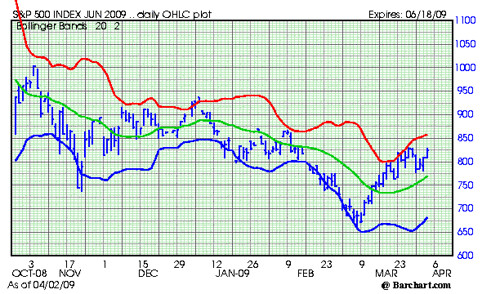
The S&P made a lower high last week giving us a point against which to plot a short term down trend (purple line). That marks 1097 as resistance and 1009/1042 as support.
By Steve Cook
All American Investor

I still want prices in the lower quadrant of the current trading range (1009-1044) before committing funds.

Note that holding 1042 would meet that criterion.


Also note that historically stocks perform their worst in September which is clearly upon us. So I am in no hurry to rush to stocks.

Wednesday, July 07, 2010

About that Recovery


Good skinny.
From the SF Fed's latest "Data Dive": Retail, office & industrial vacancies continue to climb:
Frbsf-vacancies
blog it
Original content Bob DeMarco, All American Investor

Wednesday, May 13, 2009

Trade Weighted Dollar Dropping (Graph)


You may be wondering why I put this chart up.

When the trade weighted value of the dollar drops the price we pay for imported goods goes up.

This helps explain why oil and commodity prices are now surging. When you look at this chart it might not seem like the current drop is severe. However, the trade weighted exchange value of the dollar has dropped about 4 percent in the last 45 days.

Take a look at how this is effecting oil, commodity prices, and interest rates.

We will keep you posted on this one.

Subscribe to All American Investor via Email
Bob DeMarco is a citizen journalist and twenty year Wall Street veteran. Bob has written more than 500 articles with more than 11,000 links to his work on the Internet. Content from All American Investor has been syndicated on Reuters, the Wall Street Journal, Fox News, Pluck, Blog Critics, and a growing list of newspaper websites. Bob is actively seeking syndication and writing assignments.


Follow All American Investor on Twitter

Monday, May 11, 2009

Average Hourly Week Worked Going Down (Chart)


This kinda fell through a crack on Friday. The weekly average number of hours worked continues to drop.This is a new historic low since they started compiling this series (1964). This is a small negative, but does show that things are far from picking up.

Subscribe to All American Investor via Email


Follow All American Investor on Twitter

Sunday, May 03, 2009

Nasdaq Composite 15 Year Perspective --Going Nowhere Fast (Chart)


Nasdaq Composite Monthly Bar Chart

Sometimes it is helpful to look at the market from a long term perspective. I think most believe the current bear market is new. However, the long term view indicates we have been in a bear market since the Nasdaq Composite topped out at 5,132 in March, 2000.

The high for the Nasdaq Composite in 1997 was 1690, then an all time high. You could say we are going no where fast.

Are we now in a long period of consolidation, prior to a new big bull?

Or, is the market consolidating before re-testing the October, 2002 near 1108?

I think the important perspective here is simple. This is a good time to be buying stocks on breaks to the downside. If you are young enough and investing for retirement, this might be the opportunity of a lifetime.

Baby Boomer? Ouch!

Nasdaq 15 Year Perspective 501

Thursday, April 23, 2009

Stock Market Uptrend Still In Tact (Chart)


S andf P 500 Chart 423

As evidenced by the chart, the uptrend in the S and p 500 is continuing.

This weeks test of the green line shows that support under the market is continuing to build.

One area of concern is the six straight up weeks in the market. Statistically this is unusual and rarely seen -- even in bull markets.

It will be interesting to see if the market can make it seven in a row this week.

There is serious overhead resistance right at and above current levels. It appears the market needs a catalyst to move out of this congestion.

A close about 875 is needed to bring the momentum back into the market.

We are waiting for the red line to turn up before turning on the bullish enthusiasm.
Subscribe to All American Investor via Email


Bob DeMarco is a citizen journalist and twenty year Wall Street veteran. Bob has written more than 500 articles with more than 11,000 links to his work on the Internet. Content from All American Investor has been syndicated on Reuters, the Wall Street Journal, Fox News, Pluck, Blog Critics, and a growing list of newspaper websites. Bob is actively seeking syndication and writing assignments.


More from All American Investor


Follow All American Investor on Twitter

Wednesday, April 15, 2009

Inventories, Inventory to Sales Ratio (Charts)


Inventories being reduced.

Inventories 415
Subscribe to All American Investor via Email


Inventory to sales ratio peaking? Similar to 2001 recession?

Inventory to Sales Ratio 415


Follow All American Investor on Twitter

Monday, April 06, 2009

Real Estate Loans at Commercial Banks (Graph)


Still going.

Reall Estate Loans 406

For further information, please refer to the Board of Governors of the Federal Reserve System's H.8 release.Data current through Feb 1, 2009.

Bob DeMarco is a citizen journalist and twenty year Wall Street veteran. Bob has written more than 500 articles with more than 11,000 links to his work on the Internet. Content from All American Investor has been syndicated on Reuters, the Wall Street Journal, Fox News, Pluck, Blog Critics, and a growing list of newspaper websites. Bob is actively seeking syndication and writing assignments.


Follow All American Investor on Twitter

Thursday, April 02, 2009

S & P 500 Trend Up, Resistance, Chart


June S and P Future, Chart

JUNE SP 4021

Notes:
  • The market held the down thrust below 790. The reversal indicates the uptrend is intact.
  • Yesterday's outside, up day, with a close at the high indicated that a test of the resistance in the 830 area was likely.
  • The ability of the market to hold above the green line is important and impressive.
  • Short term support is at 770 and rising.
  • Near term resistance is in the 830 area. Overhead resistance is at 857 and rising.
  • Trades and or a close above 832 will test the will of the shorts.
  • The market continues to trade up against bad news. Shorts continue to pile into the market believing that the market should be going down against this evidence.
  • All I can say to shorts is---Don't Fight the Tape.
  • Technical evidence continues to indicate higher prices.
See: 

They called me crazy, S and P 900-1000


Bob DeMarco is a citizen journalist and twenty year Wall Street veteran. Bob has written more than 500 articles with more than 11,000 links to his work on the Internet. Content from All American Investor has been syndicated on Reuters, the Wall Street Journal, Fox News, Pluck, Blog Critics, and a growing list of newspaper websites. Bob is actively seeking syndication and writing assignments.


Follow All American Investor on Twitter
Subscribe to All American Investor via Email

Saturday, March 28, 2009

APPLE (AAPL) or NVIDIA (NVDA) which was the Better Buy? (Chart)


Chart, APPLE (AAPL) versus NVIDIA (NVDA), Ten Year Chart, Comparison, Monthly Percent Change.

Apple Versus Nvidia percent change 328


From 2000 to late 2003, Apple traded sideways in a tight range. You had plenty of time to understand the implications of the MAC and the IPod. Kids were begging for the IPod long before the stock took off to the upside.

For most of the decade, NVDA would have been the better buy.

Apple was clearly the better buy over the entire ten year period. However, compared to the market return of most stocks over this same time frame, both Apple and Nvidia were good buys. Of late NVDA is taking off to the upside.
Subscribe to All American Investor via Email
Follow All American Investor on Twitter

GoldCorp (GG) Twelve Times Your Money in Ten Years (Chart)


Gold Corp (GG), Ten Year Chart, Monthly (not dividend adjusted).

Goldcorp 10 Year 328


You don't hear much about Gold Corp (GG). The gold stock has risen from the $2.50 area in 1999 to a high of $52.65 during July, 2008 (prices are adjusted for stock splits).

The stock closed Friday at $33.76. GoldCorp dropped to a low in the $14.00 area in October, 2008 and is now moving up again.

If you had invested $10,000 in GoldCorp in 1999, it would now be worth more than $125,000. This does not include adjustments for dividends. 12.5 times your money in ten years, not bad.
Subscribe to All American Investor via Email


Bob DeMarco is a citizen journalist and twenty year Wall Street veteran. Bob has written more than 500 articles with more than 11,000 links to his work on the Internet. Content from All American Investor has been syndicated on Reuters, the Wall Street Journal, Fox News, Pluck, Blog Critics, and a growing list of newspaper websites. Bob is actively seeking syndication and writing assignments.


Follow All American Investor on Twitter

More from All American Investor


Thursday, March 26, 2009

S and P Chart Healthy and Congested


S and P 500 Cash, Chart, March 26.

S an P 500 Chart 326


This S and P chart continues to show that technical resilience is building. The S and P is still in a range expansion and this indicates that volatility could pick up at any time. The red line (plus two standard deviations) is sloping up and the market is continuing to hug the line. All short term positives.

The other day we mentioned that there was considerable resistance and congestion in the 825 area. The market continues trying to attack this area. There is more upside potential on a short term basis then we had a few days ago, now up to the 850 area. Good support is down around 750 and is rising.

Bulls should be a bit cautious right now. If the market can't get firmly through 825 soon, the market might be ripe for a further test of the downside to establish support.

Short term still looks good to me.


Subscribe to All American Investor via Email


Bob DeMarco is a citizen journalist and twenty year Wall Street veteran. Bob has written more than 500 articles with more than 11,000 links to his work on the Internet. Content from All American Investor has been syndicated on Reuters, the Wall Street Journal, Fox News, Pluck, Blog Critics, and a growing list of newspaper websites. Bob is actively seeking syndication and writing assignments.

Follow All American Investor on Twitter
More from All American Investor


Tuesday, March 17, 2009

The Real Picture on Housing Starts--Chart


They say a picture is worth a thousand words. You can decide for yourself.

HOUSING STARTS
Privately-owned housing starts in February were at a seasonally adjusted annual rate of 583,000. This is 22.2 percent (±13.8%) above the revised January estimate of 477,000, but is 47.3 percent (±5.3%) below the revised February 2008 rate of 1,107,000.

Single-family housing starts in February were at a rate of 357,000; this is 1.1 percent (±11.0%)* above the January figure of 353,000.

The February rate for units in buildings with five units or more was 212,000.
Housing Starts Feb 2009

Source: ST. Louis Federal Reserve, Census Bureau
Subscribe to All American Investor via Email


Friday, February 27, 2009

Stock Market still under extreme pressure--25 year look--Chart


The chart below spans twenty five years for the S and P 500. Each bar is one month.

I have been writing for two weeks about the downside range expansion in the market (see previous posts). The range expansion is still in force. Last time, I mentioned that the market rarely closes lower 7 days in a row and it was due for a rally from the 741 area. The rallies which usually last two days came and went like the weather in Amarillo.

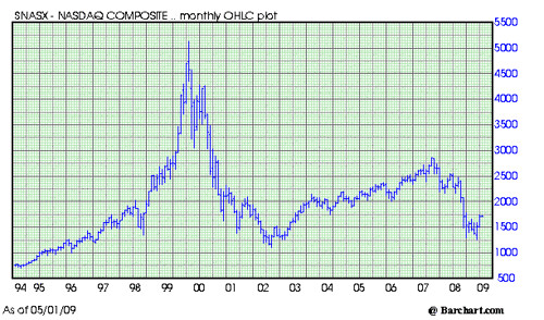
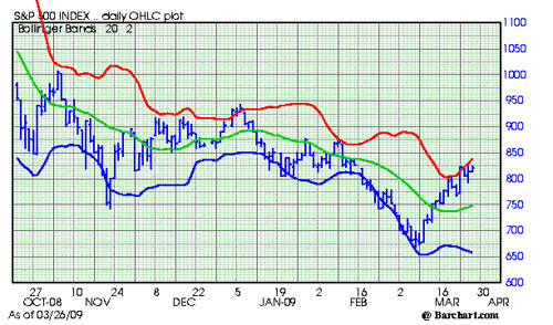
I want to issue a major note of caution here. The formation above could be signaling a market capitulation. Think about it like flushing a toilet. You know what goes down the toilet=, but then the bowl fills right back up. My guess is, if flushed it will be a great opportunity. Markets rarely capitulate, however, when everyone is looking for it.
A look at this long term pattern shows that the market is extremely vulnerable. The fundamental news, especially the size of budget deficit continues to weigh on the market. The only question now is do we go down slow or fast.

For today, the S and P will find good support on any thrust under 732. So don't get nutty with the short positions.

This will be the third straight week down and sixth out of the last seven. This indicates the market is due for a good rally soon. But from what level? New shorts at this level don't make much sense.
clipped from charts.barchart.com

Chart for S and P 500


Subscribe to All American Investor via Email


Follow us on Twitter

Bob DeMarco is a citizen journalist, blogger, and Caregiver. In addition to being an experienced writer he taught at the University of Georgia , managed on Wall Street at Bear Stearns, was CEO of IP Group, and is a mentor. Bob currently resides in Delray Beach, FL where he cares for his mother, Dorothy, who suffers from Alzheimer's disease. Bob has written more than 500 articles with more than 11,000 links to his work on the Internet. His content has been syndicated on Reuters, the Wall Street Journal, Fox News, Pluck, BlogCritics, and a growing list of newspaper websites (15). Bob is actively seeking writing assignments and syndication.


More from All American Investor


Friday, February 20, 2009

Stocks Ready to Head down as Range Expands


If you would like to see more information like this consider signing up for the email list or for the RSS feed. If I find that people are interested in this kind of information I will spend more time putting it up.
clipped from charts.barchart.com
Chart for S&P 500
blog it


The chart above is a bar chart of the the S and P 500 index (cash). The green line is the twenty day moving average. The blue and red lines represent two standard deviations below and above the mean. When the market exceeds the red or blue line the market is overextended--oversold or overbought.

Right now, the market is oversold intraday--price below 777.00. As it a result, baring a disaster scenario, the market is likely to support at prices below this line today.

You should notice that the blue and green line are getting farther apart. Most times this indicates two things:
  • the market is likely to get more volatile
  • and, the range that the market is going to trade is expanding.
When the market range expands it becomes likely that the market is going to move up and down rapidly and the intraday trading is going to become more frenzied. This explain why markets often have violent rallies or dips that go against the trend of the market.

Right now, the blue line is sloping down at about ten points a day and is increasing--bad news. This means the market could be getting ready to make a new major move to the downside. In a scenario like this you should avoid two things.

  • First, when the market is below the blue line resist the temptation to go short. More often than not you will get killed.
  • Two, unless you are an excellent trader resist the temptation to buy the market for a position trade.
From a technical point of view the market appears to be turning down. Some people tend to think when the market gets oversold it is a sign that the market is going up. This is often true for a very short period of time. But, when a market is oversold more often than not it means the market is going to keep going in that directions until it finds a level of homeostasis.

My point. From a technical point of view the market is rolling over and weakening. When a market turns down the likelihood that it can go a lot lower increases dramatically. If the market is in a downtrend it will usually rally hard on good news and then drop right back down like a lead stone. Of course, if the market were to drop hard right this minute, it would likely bounce up nicely because it would be more than 2 standard deviations below the line---a statistical level that indicates the market has moved too far in that direction--short term.

You might also notice that the S and P has held the 800 level for months. The only exception to this was in November when it spiked down and then spiked right back above 800. This time around it has breached the 800 level and no longer is showing technical resiliency.

The market appears to be ready to go a lot lower. So it is a good time to be very cautious with your investments.

This is not an offer to buy or sell. I could be buying or selling the market at any time. The above examples are purely informational. I am not recommending anything. Buy, sell, or invest in the market at your own risk.

More from All American Investor