Showing posts with label comparison. Show all posts

Tuesday, June 02, 2009

Corporate Aaa | Ten Year Treasury (Chart)


Moody's Seasoned Aaa Corporate Bond Yield, Weekly, Ending Friday, Percent (Blue)
10-Year Treasury Constant Maturity Rate, Daily, Percent (Red)
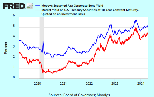


Spread narrows slightly, but still a historically wide risk premium.

Rates moving up across all quality preferences.
Subscribe to All American Investor via Email


Kindle: Amazon's Wireless Reading Device (Latest Generation)

Monday, May 04, 2009

Nasdaq Composite Outperforming on Rally from Lows (Chart)


Nasdaq Composite (Red) versus Dow Jones Industrial (Green), Percent Change, Chart

The comparison chart shows that the Nasdaq is more volatile than the Dow.

Since the March lows the Nasdaq has dramatically outperformed the Dow. This indicates that investors are very bullish on tech stocks. Tech stocks are usually good investments in an economic turnaround. An added plus is that Tech stocks are not usually burdened by debt.

The Nasdaq is likely to be extremely vulnerable or any market correction. It is time to be careful.

Nasdaq versus Dow Percent Change 504
Subscribe to All American Investor via Email
Bob DeMarco is a citizen journalist and twenty year Wall Street veteran. Bob has written more than 500 articles with more than 11,000 links to his work on the Internet. Content from All American Investor has been syndicated on Reuters, the Wall Street Journal, Fox News, Pluck, Blog Critics, and a growing list of newspaper websites. Bob is actively seeking syndication and writing assignments.


Follow All American Investor on Twitter

Saturday, March 28, 2009

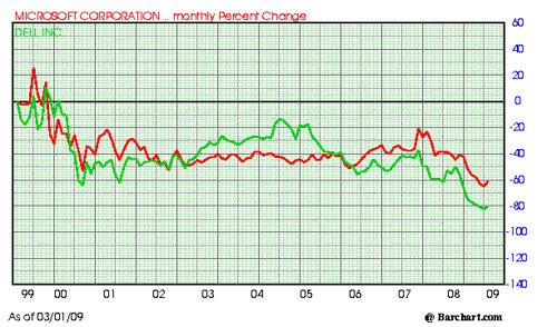
Microsoft and Dell, Dead Money, Chart and Comparison


Microsoft (MSFT) and Dell (Dell) , Ten Year Comparison, Percent Change, Chart

Microsoft versus Dell 328


Both of these stocks peaked near the end of the Internet Stock boom. Both stocks have been dead money.

In defense of Microsoft, they have paid out some tasty dividends and the chart does not reflect this.

Did you own these dogs?
Subscribe to All American Investor via Email
Follow All American Investor on Twitter

APPLE (AAPL) or NVIDIA (NVDA) which was the Better Buy? (Chart)


Chart, APPLE (AAPL) versus NVIDIA (NVDA), Ten Year Chart, Comparison, Monthly Percent Change.

Apple Versus Nvidia percent change 328


From 2000 to late 2003, Apple traded sideways in a tight range. You had plenty of time to understand the implications of the MAC and the IPod. Kids were begging for the IPod long before the stock took off to the upside.

For most of the decade, NVDA would have been the better buy.

Apple was clearly the better buy over the entire ten year period. However, compared to the market return of most stocks over this same time frame, both Apple and Nvidia were good buys. Of late NVDA is taking off to the upside.
Subscribe to All American Investor via Email
Follow All American Investor on Twitter